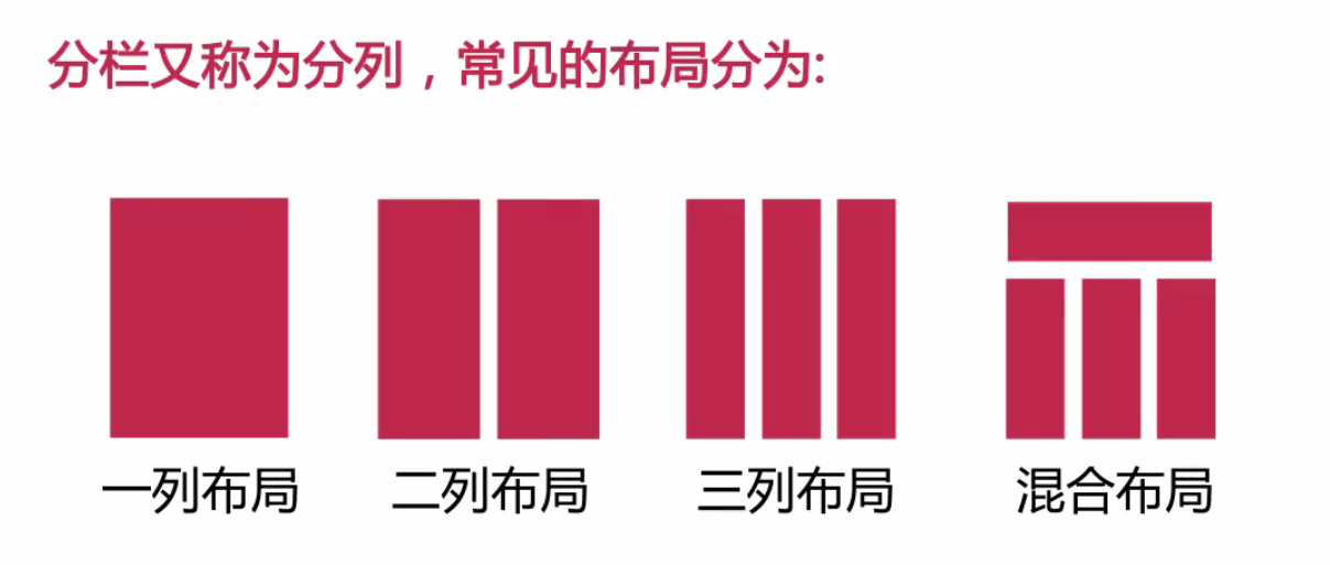
最常見的是混合布局。
制作布局案例:
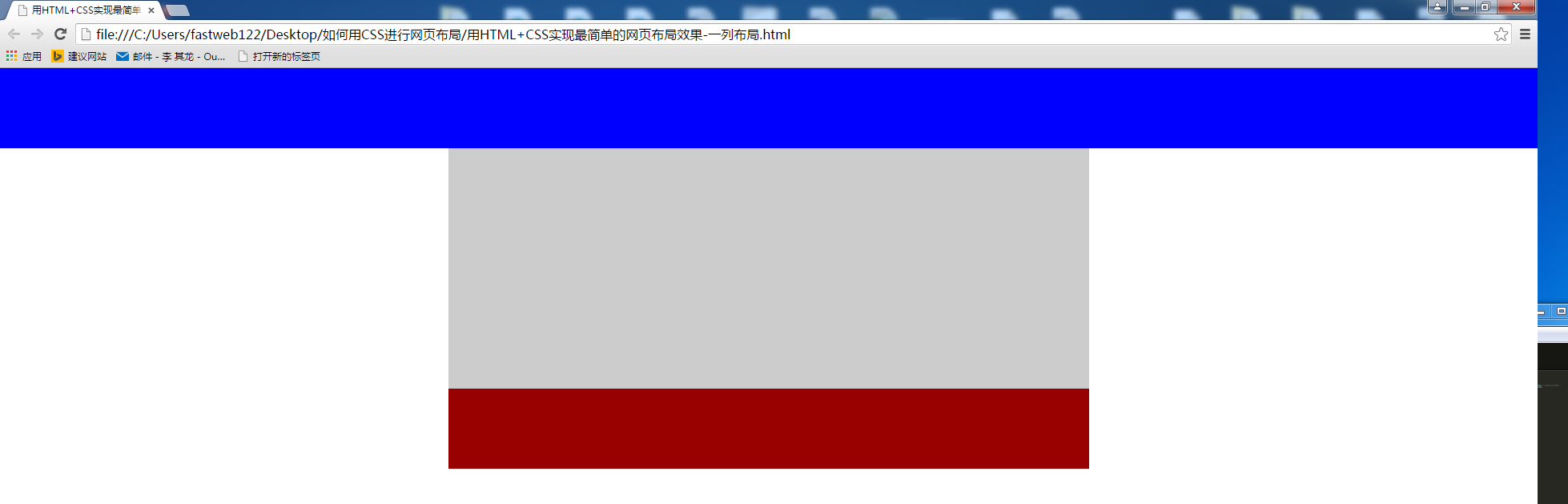
1.一列布局
<!DOCTYPE>
<html>
<head>
  <meta charset="UTF-8">
  <title></title>
  <style type="text/css">
    body{margin:0;padding-left: 0;}
    .top{height: 100px;background:blue;}
    .main{width:800px;height:300px;background:#CCC;margin:0 auto;}  /* margin:0 auto;居中 */
    .foot{width:800px;height:100px;background:#900;margin: 0 auto;}
  </style>
</head>
<body>
   <div class="top"></div>
   <div class="main"></div>
   <div class="foot"></div>
</body>
</html>
效果如下:
2.兩列布局
<!DOCTYPE>
<html>
<head>
  <meta charset="UTF-8">
  <title></title>
  <style type="text/css">
    body{margin:0;padding: 0;}
    .left{width:20%;height:500px;float:left;background: #CCC;}
    .right{width:80%;height:500px;float:right;background: #ddd;}
  </style>
</head>
<body>
   <div class="left"></div>
   <div class="right"></div>
</body>
</html>
效果如下:
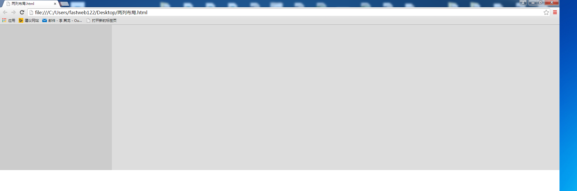
該效果是兩列自適應(yīng)组砚,會隨著瀏覽器的縮放自動調(diào)整頁面的寬帶
自適應(yīng)寬度的兩列布局用的很少静盅,用得比較多的是固定寬度的兩列布局哆料。
增加一個父級,代碼如下:
<!DOCTYPE>
<html>
<head>
   <meta charset="UTF-8">
   <title></title>
   <style type="text/css">
     body{margin:0;padding: 0;}
     .main{width:800px;margin:0 auto;}
     .left{width:20%;height:500px;float:left;background: #CCC;}
     .right{width:80%;height:500px;float:right;background: #ddd;}
   </style>
</head>
<body>
   <div class="main">
      <div class="left"></div>
      <div class="right"></div>
   </div>
</body>
</html>
效果如下:
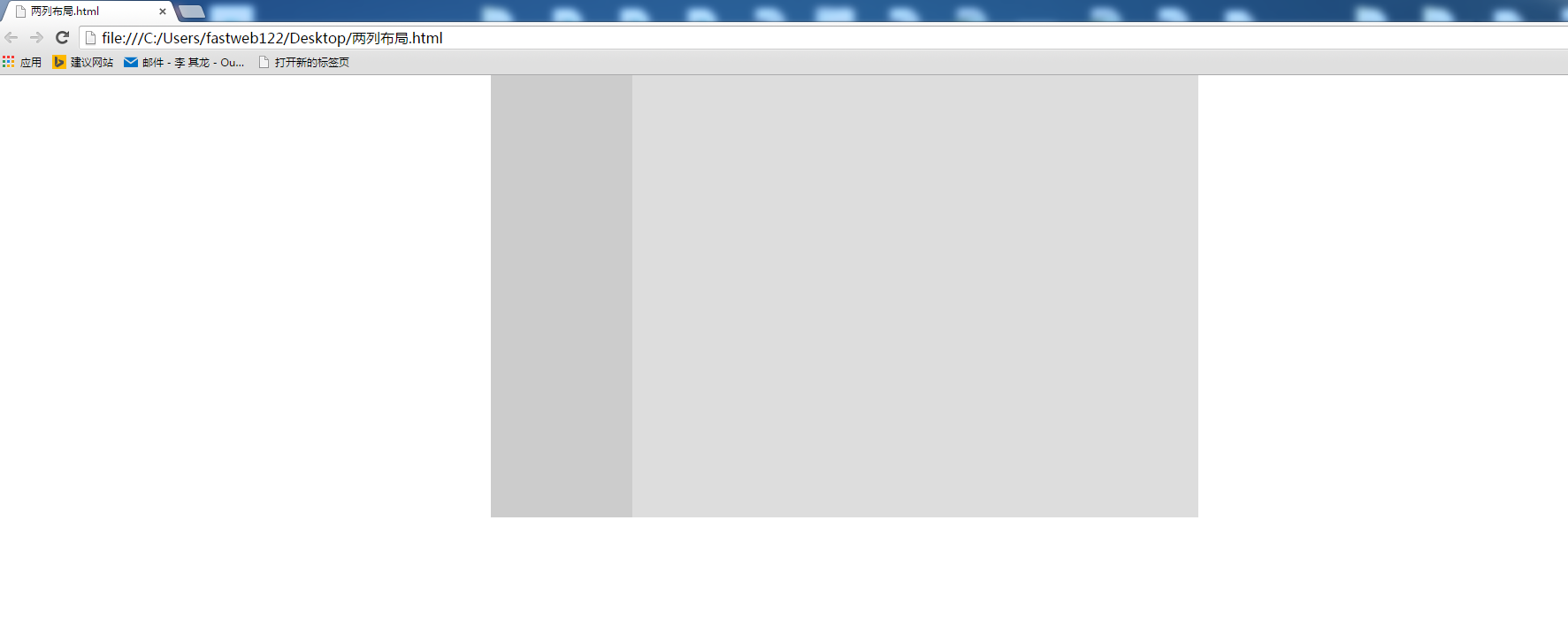
浮動(float)和 絕對定位(position:absolute)兩個css設(shè)置恋捆,可以讓元素脫離文檔流溉瓶。
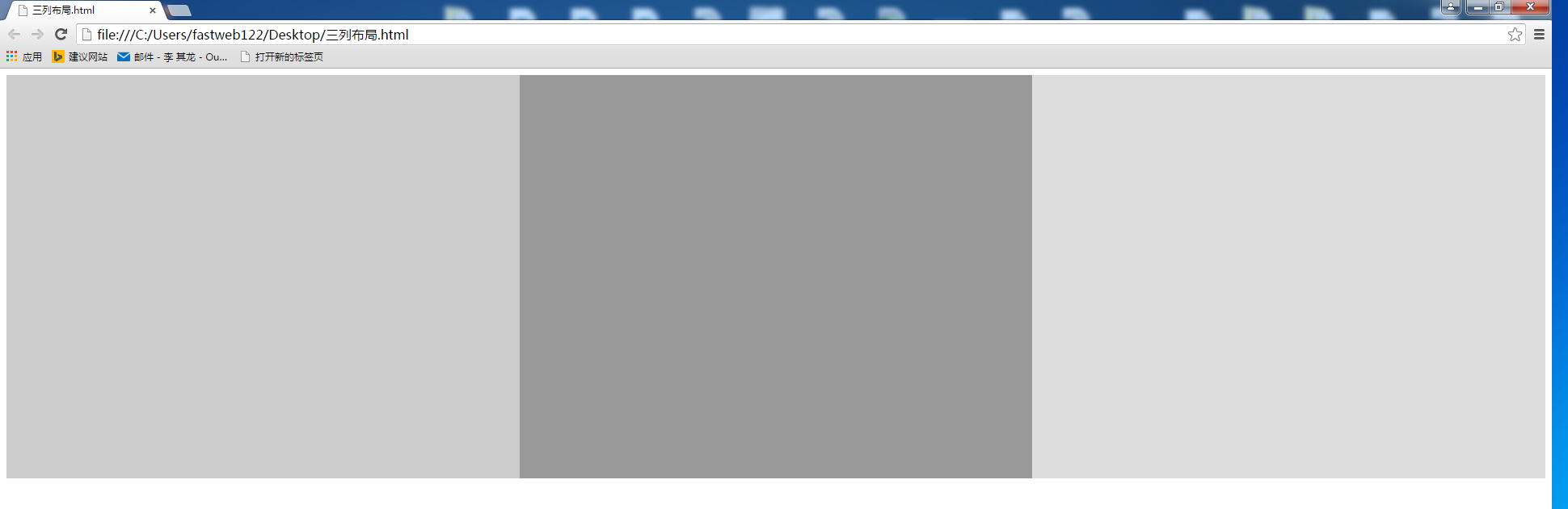
3.三列布局
<!DOCTYPE>
<html>
<head>
  <meta charset="UTF-8">
  <title></title>
  <style type="text/css">
     .left{width:33.33%;height: 500px;float:left;background: #CCC;}
     .middle{width:33.33%;height: 500px;float:left;background: #999;}
     .right{width:33.33%;height: 500px;float:right;background: #ddd;}
   </style>
 </head>
 <body>
      <div class="left"></div>
      <div class="middle"></div>
      <div class="right"></div>
 </body>
 </html>
效果如下(自適應(yīng)的三列布局):
修改代碼后利用浮動看三個板塊是否能排列在一起
 <!DOCTYPE>
 <html>
 <head>
   <meta charset="UTF-8">
   <title></title>
   <style type="text/css">
     .left{width:200px;height: 500px;float:left;background: #CCC;}
     .middle{height: 500px;float:left;background: #999;}
     .right{width:300px;height: 500px;float:right;background: #ddd;}
   </style>
 </head>
 <body>
     <div class="left">200px</div>
     <div class="middle">qqqqqqqqqqqqqqqqqqqqqqqqqqqqqqqqqqqqqqqqqqqqqqqqqqqqqqqqqqqqqqqqqqqqqqqqqqqqqqqqqqqqqqqqqqqqqqqqqqqqqqqqqqqqqqqqqqqqqqqqqqqqqqqqqqqqqqqqqqqqqqqqqqqqqqqqqqqqqqqqqqqqqqqqqqqqqqqq</div>
     <div class="right">300px</div>
 </body>
 </html>
實際效果如下:利用浮動后急鳄,排列都亂了
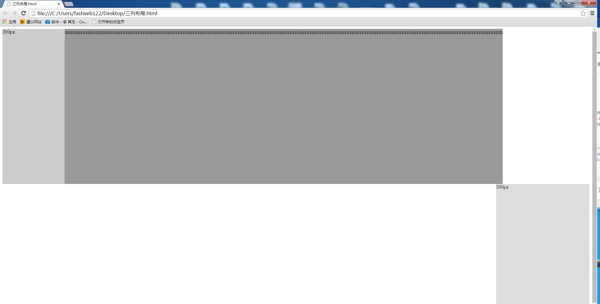
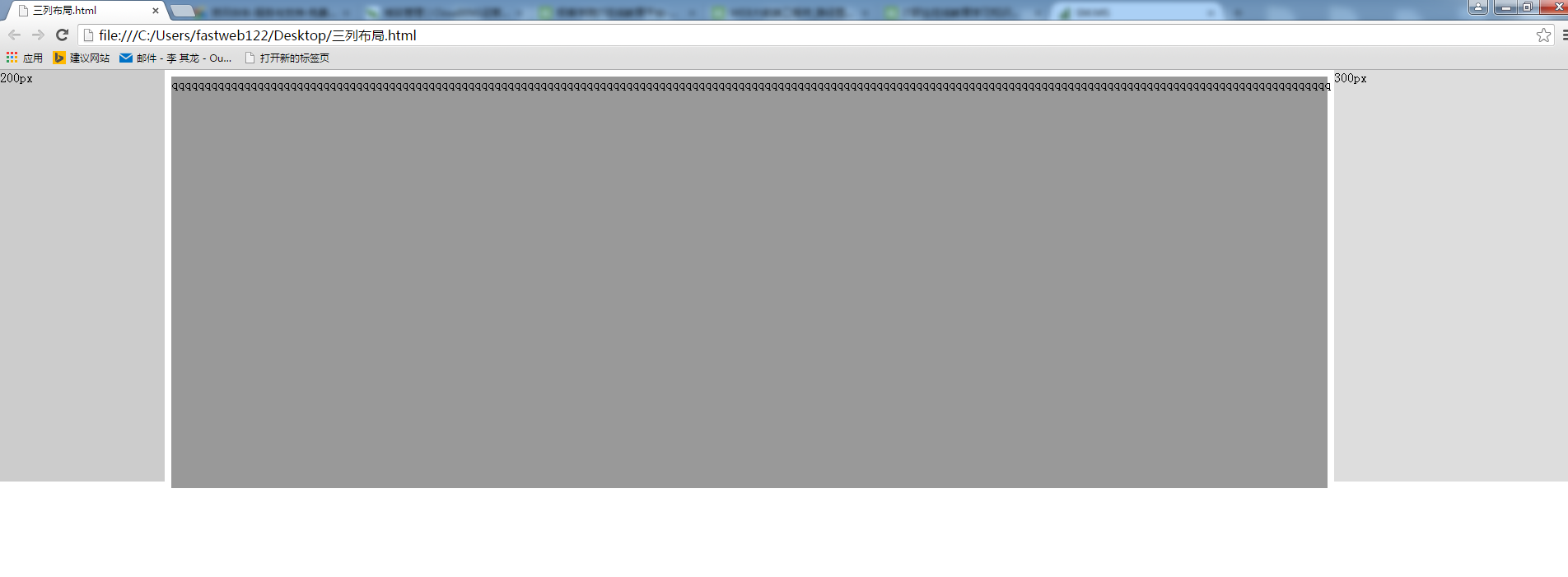
如何實現(xiàn)他們都在一排中呢?去掉浮動堰酿,使用定位
  <!DOCTYPE>
  <html>
  <head>
   <meta charset="UTF-8">
   <title></title>
   <style type="text/css">
      .left{width:200px;height: 500px;float:left;background: #CCC;position: absolute;left:0;top:0;}
      .middle{height: 500px;background: #999;margin: 0 300px 0 200px;}
      .right{width:300px;height: 500px;float:right;background: #ddd;position: absolute;right:0;top:0;}
   </style>
 </head>
 <body>
     <div class="left">200px</div>
     <div class="middle">qqqqqqqqqqqqqqqqqqqqqqqqqqqqqqqqqqqqqqqqqqqqqqqqqqqqqqqqqqqqqqqqqqqqqqqqqqqqqqqqqqqqqqqqqqqqqqqqqqqqqqqqqqqqqqqqqqqqqqqqqqqqqqqqqqqqqqqqqqqqqqqqqqqqqqqqqqqqqqqqqqqqqqqqqqqqqqqq</div>
     <div class="right">300px</div>
 </body>
 </html>
實際效果:
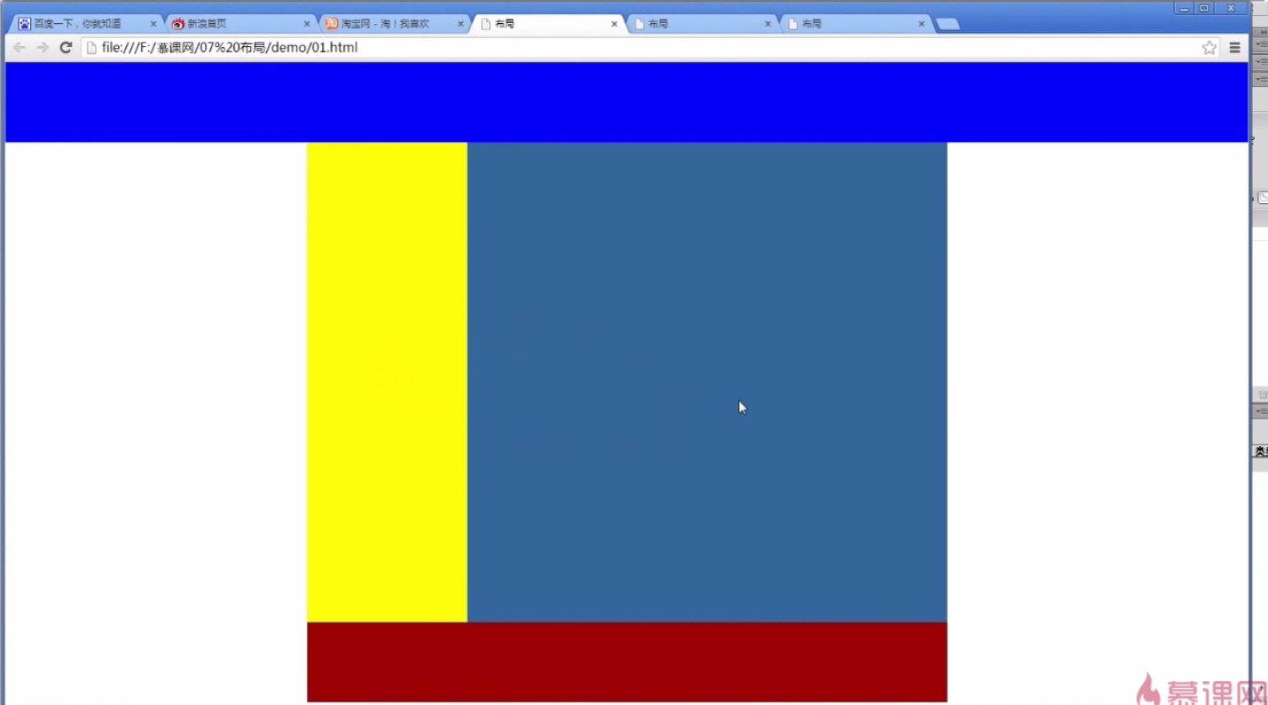
4.混合布局
 <!DOCTYPE>
 <html>
 <head>
    <meta charset="UTF-8">
    <title></title>
    <style type="text/css">
         body{margin:0;padding-left: 0;}
         .top{height: 100px;background:blue;}
         .main{width:800px;height:300px;background:#CCC;margin:0 auto;}
         .left{width:200px;height: 600px;background: yellow;float:left;}
         .right{width:600px;height: 600px;background: #369;float:right;}
         .foot{width:800px;height:100px;background:#900;margin:0 auto;}
    </style>
 </head>
 <body>
    <div class="top"></div>
    <div class="main">
          <div class="left"></div>
          <div class="right"></div>
    </div>
    <div class="foot"></div>
 </body>
 </html>
實際效果:
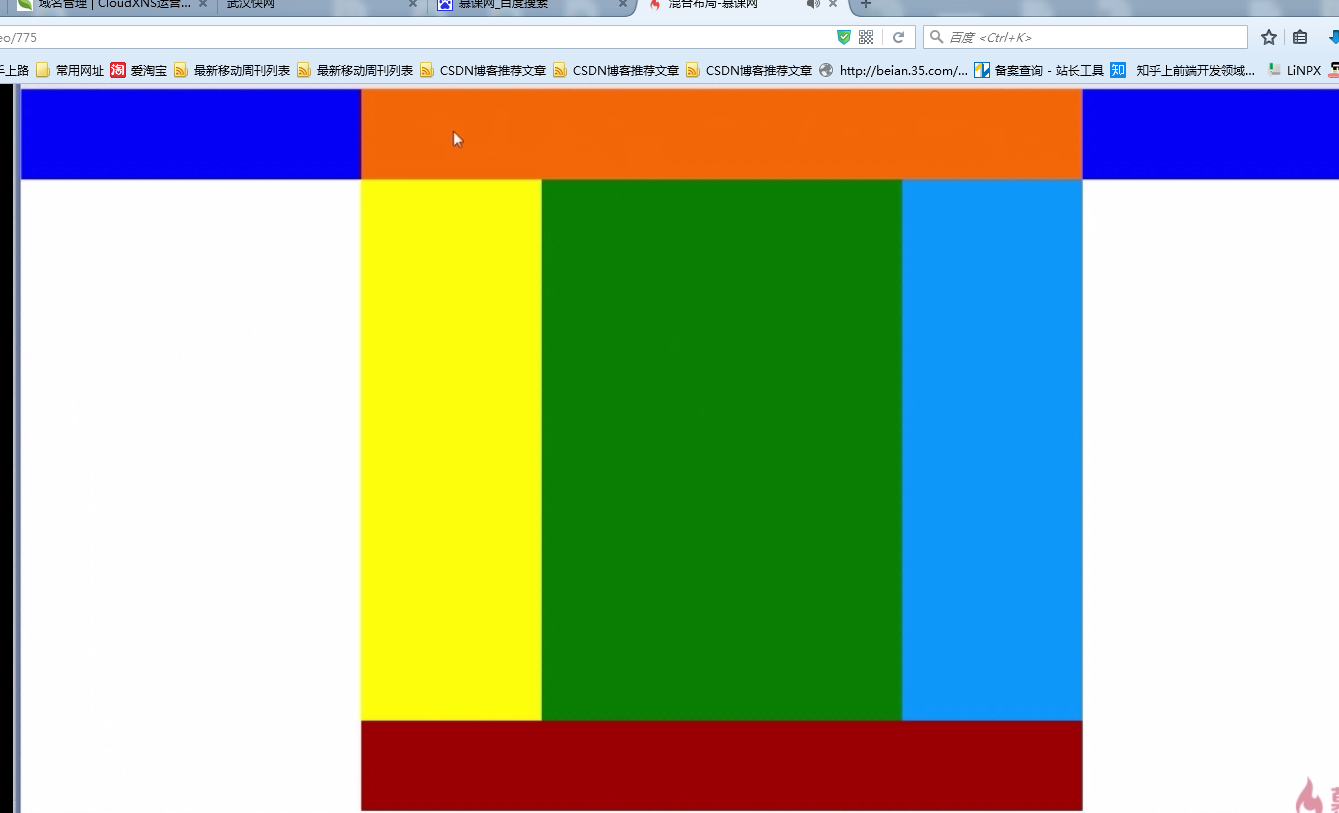
分割小模塊:
代碼如下:
 <!DOCTYPE>
 <html>
 <head>
   <meta charset="UTF-8">
   <title></title>
   <style type="text/css">
      body{margin:0;padding-left: 0;}
      .top{height: 100px;background:blue;}
      .head{height: 100px;width:800px;background:#f60;margin:0 auto;}
      .main{width:800px;height:300px;background:#CCC;margin:0 auto;}
      .left{width:200px;height: 600px;background:yellow;float:left;}
      .right{width:600px;height: 600px;background:#369;float:right;}
      .sub_l{width:400px;height: 600px;background:green;float:left;}
      .sub_r{width:200px;height: 600px;background:#09F;float:right;}
      .foot{width:800px;height:100px;background:#900;margin:0 auto;}
   </style>
 </head>
 <body>
    <div class="top">
        <div class="head"></div>
    </div>
    <div class="main">
        <div class="left"></div>
        <div class="right">
            <div class="sub_l"></div>
            <div class="sub_r"></div>
        </div>
    </div>
    <div class="foot"></div>
  </body>
  </html>
實際效果如下: